Running a dairy farm is a numbers game played twice a day, every day, no exceptions. At Greenfields Dairy, 68 cows split across Holstein, Jersey, and Guernsey herd groups go through the morning and evening parlor shifts, and every cow’s liters are recorded by hand. The challenge is turning that growing pile of milking entries into something the farm manager can actually act on, ideally before a small dip in yield becomes a vet bill. That is exactly what this dashboard does.
The hero KPI answers the most-asked question on the farm
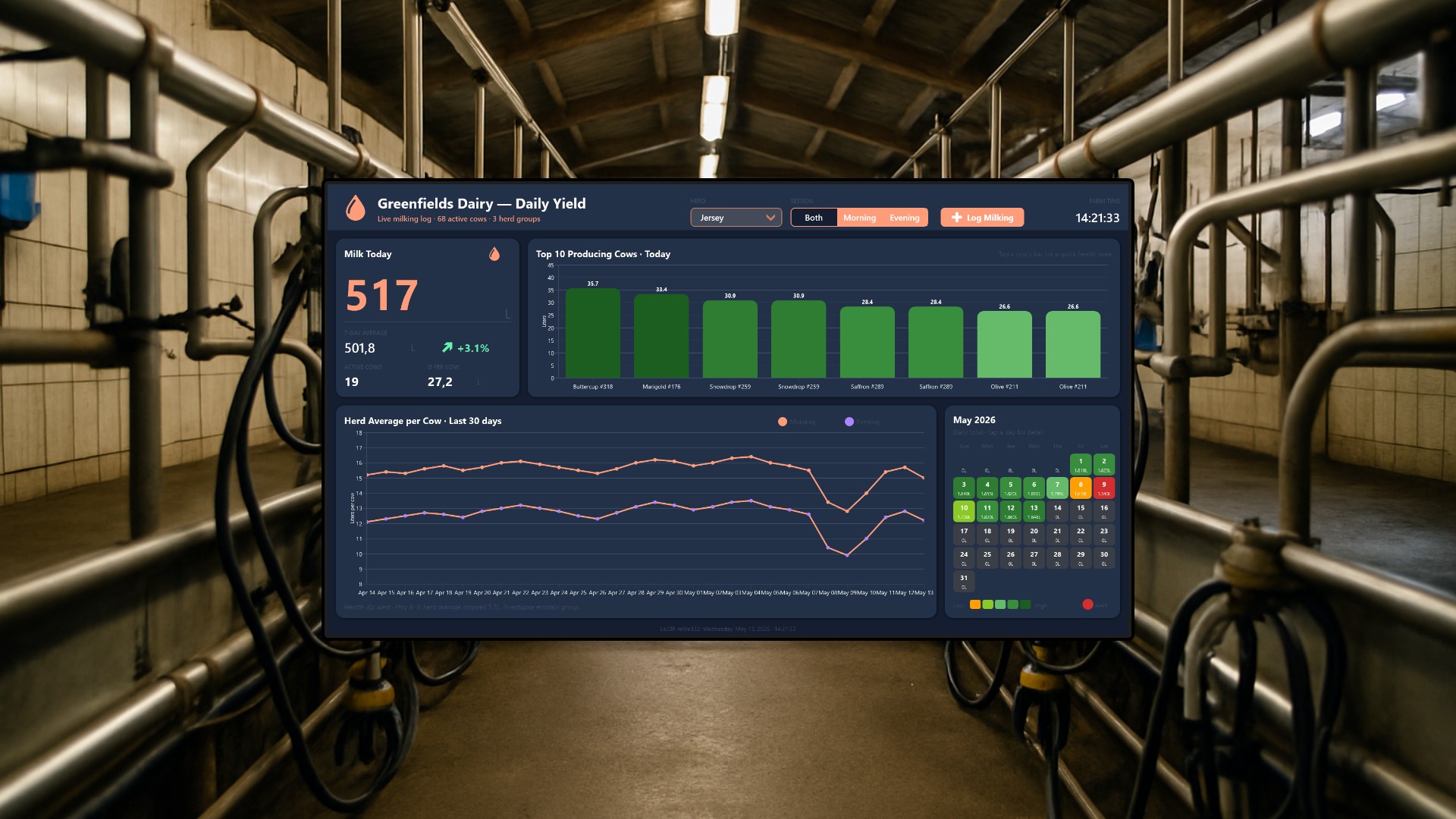
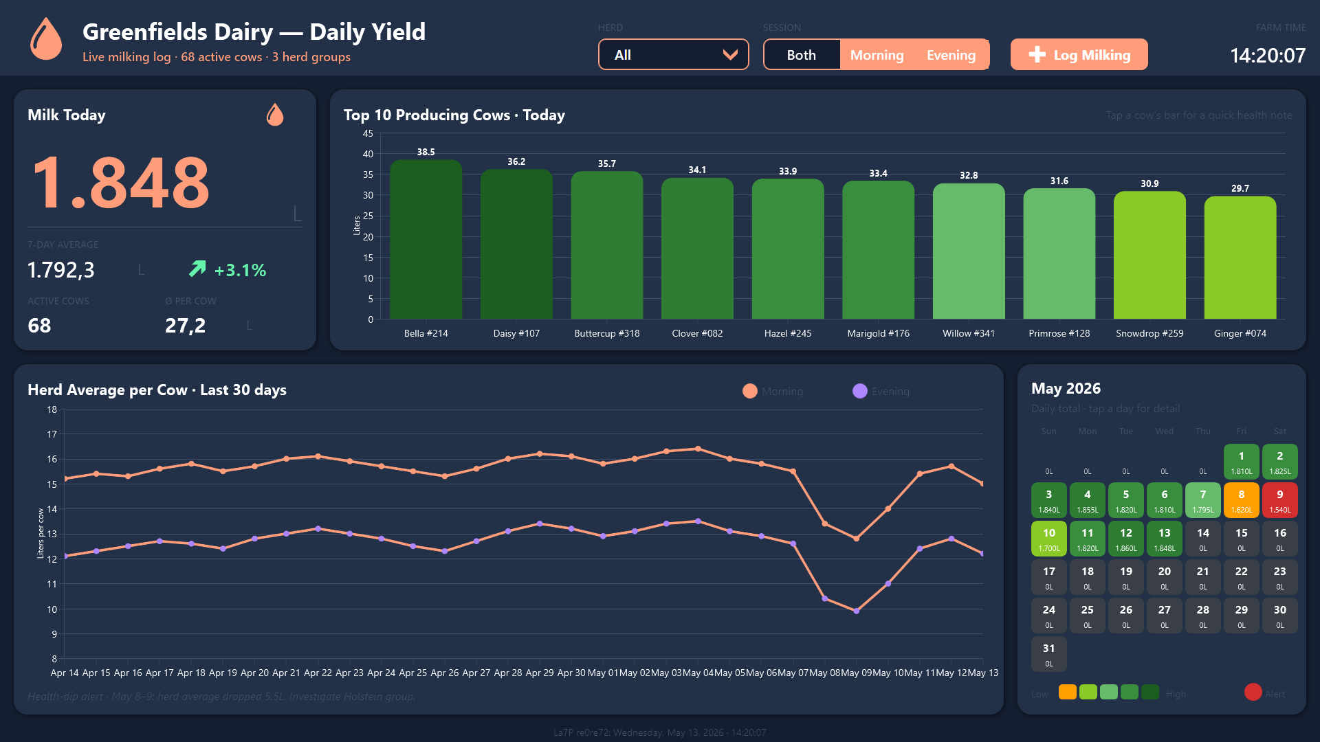
Walk into any dairy office in the morning and the first question is always the same: “How much did we collect?” The big tile on the left of the dashboard answers it without anyone having to open a spreadsheet. Today’s total reads 1,847.5 liters, sitting just above the rolling 7-day average of 1,792.3 L, with a green +3.1% delta that makes “we are on track” a one-second decision.
Two supporting KPIs sit underneath: 68 active cows and an average of 27.2 liters per head. Splitting the headline number into “how many animals milked” and “how much each one gave” is the trick that separates a normal day from an alarming one. A drop in total liters with the same per-head average means a cow is out of rotation. A drop in per-head average with the same headcount means something is happening to the herd itself.
Top 10 producers, ranked and color-coded
The bar chart in the upper right ranks today’s strongest milk producers. Bella #214, Daisy #107, and Buttercup #318 lead the pack, color-coded in graduated greens so the eye lands on the top of the list first. For a herd manager, this list does double duty: it identifies the breeding-program candidates and the high-value animals worth watching, but it also flags the silent failure that paper logs miss, the moment a usually-top producer falls off the leaderboard.

The 30-day trend catches what the daily total hides
Below the leaderboard, a 30-day line chart trends the herd average per cow, with a peach line for the morning session and a violet line for the evening. The chart leaves the V-shaped dip on May 8 and May 9 clearly visible, dropping to 22.7 L per cow combined. Underneath, a status note spells it out: “Health-dip alert: May 8 to 9, herd average dropped 5.5L. Investigate Holstein group.”
This is the kind of pattern that simply does not survive paper records. A single bad day looks like a bad day. Two bad days in a row, isolated to one breed group, looks like mastitis, lameness, heat stress, or a feed issue brewing in the barn. The line chart turns that pattern into something the manager spots before morning coffee.
The heatmap calendar makes a month of milkings one screen
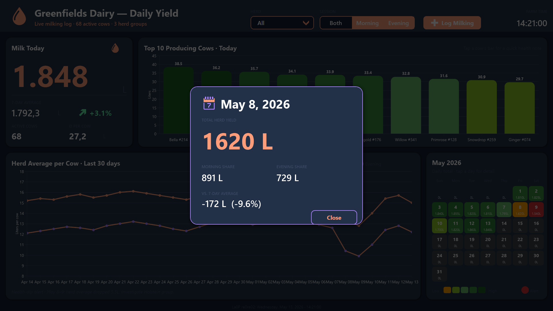
On the right, the current month renders as a grid of colored tiles. Amber for low yields, graduated greens for normal yields, and a hard red alert on May 9 that you cannot help but look at. Today’s tile, May 13, gets a peach border so the manager always knows where they are in the cycle. Tapping a day opens a detail dialog with the total, the morning vs. evening split, and how the day compares against the 7-day average, so going from “something looks off in the heatmap” to a concrete number takes exactly one tap.
Logging entries from the parlor, not from a desk
The dashboard is not just a viewer. The prominent Log Milking button in the header opens a modal that the milking parlor staff use directly: cow name or ear tag, herd group, session (morning or evening), and liters via a 0 to 50 L slider with 5 L tick marks. The entry is appended to a shared dairyfarm_milklog table on the Peakboard Hub, so every display across the farm, the office wall, the hallway between the parlor and the cold tank, the tablet in the pit, picks up the new row immediately.
A second Hub-backed list, dairyfarm_healthalerts, gives the visiting veterinarian a way to push alerts back into the same ecosystem. And because the herd filter at the top (All / Holstein / Jersey / Guernsey) is shared across all dairy boards via MQTT, when the night manager switches to “Jersey” on the parlor screen, the office display follows automatically. One filter, one farm.
Result
What used to be a clipboard ritual is now a working operations screen. The farm manager sees today’s total, today’s leaders, the 30-day trend, and the month-at-a-glance calendar without opening a single file. The May 8 to 9 dip is no longer a hindsight discovery, it is a visible red tile and a written alert pointing at the Holstein group. For a farm where the margin between a healthy cow and a sick one is measured in days, that head start is the whole point of the board.