An overdue oil change on a single combine can stall an entire field crew for two days. When the weather window for the wheat harvest is six days wide, that is the difference between a profitable season and a salvage operation. Agricultural cooperatives that share machinery across dozens of member farms feel this acutely: every hour a tractor spends grounded on a hydraulic fault is an hour someone else cannot plant. In this article we walk through a workshop dashboard built for exactly that audience - the foreman, the fleet manager, and the mechanics who keep the cooperative’s fleet of tractors and combines on the field.
The audience and the room it lives in
The screen is meant for a large display in the cooperative’s workshop or operations office. Mechanics gather around it in the morning to plan their day, the foreman uses it to brief incoming drivers, and during the weekly maintenance huddle it is projected onto the wall. The design is dense but glanceable: a manager walking past should be able to tell in two seconds whether anything is grounded, and a technician approaching with a tablet should be able to dive into a specific vehicle and log a completed service without leaving the dashboard.
Three rotating views split the workload between the casual onlooker and the hands-on technician. Swipe-left and swipe-right gestures move between the screens for touch displays, and dedicated navigation buttons cover non-touch installations.
Fleet overview - the at-a-glance view
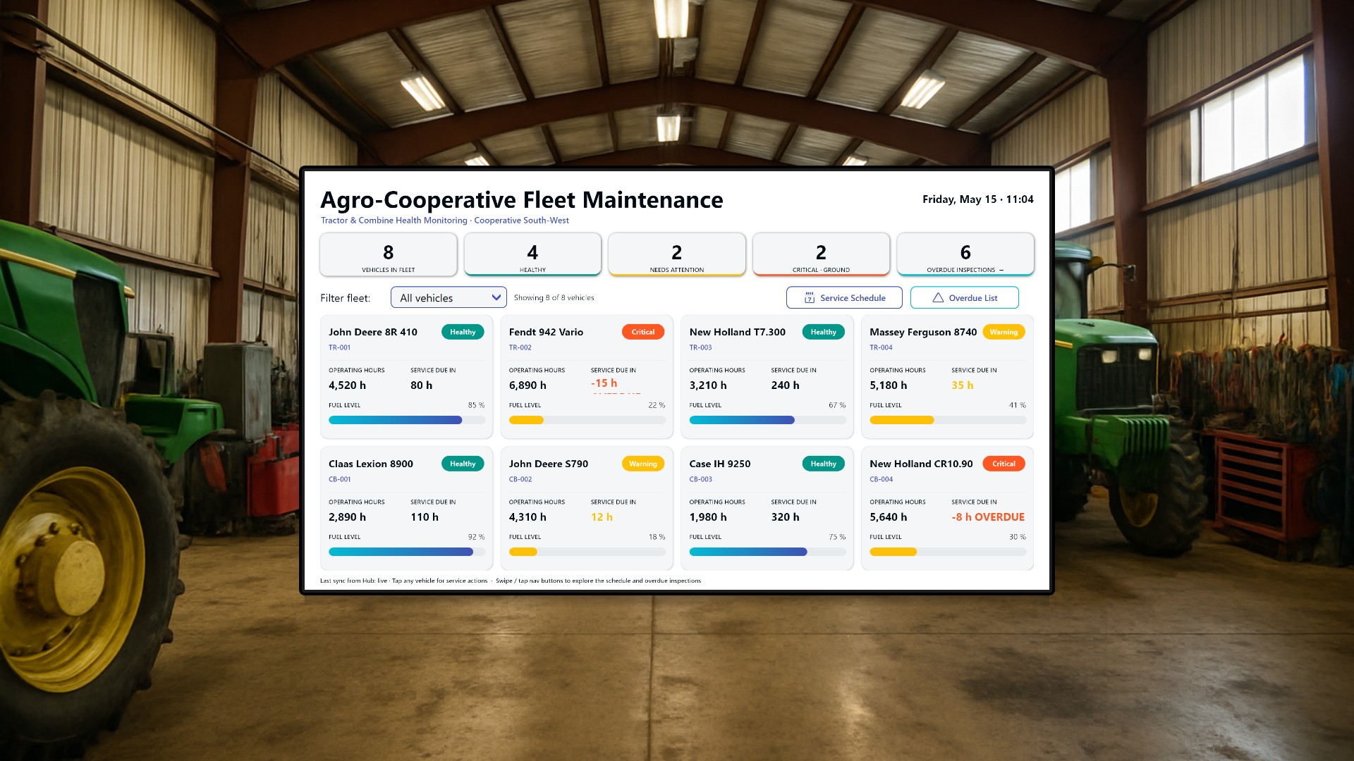
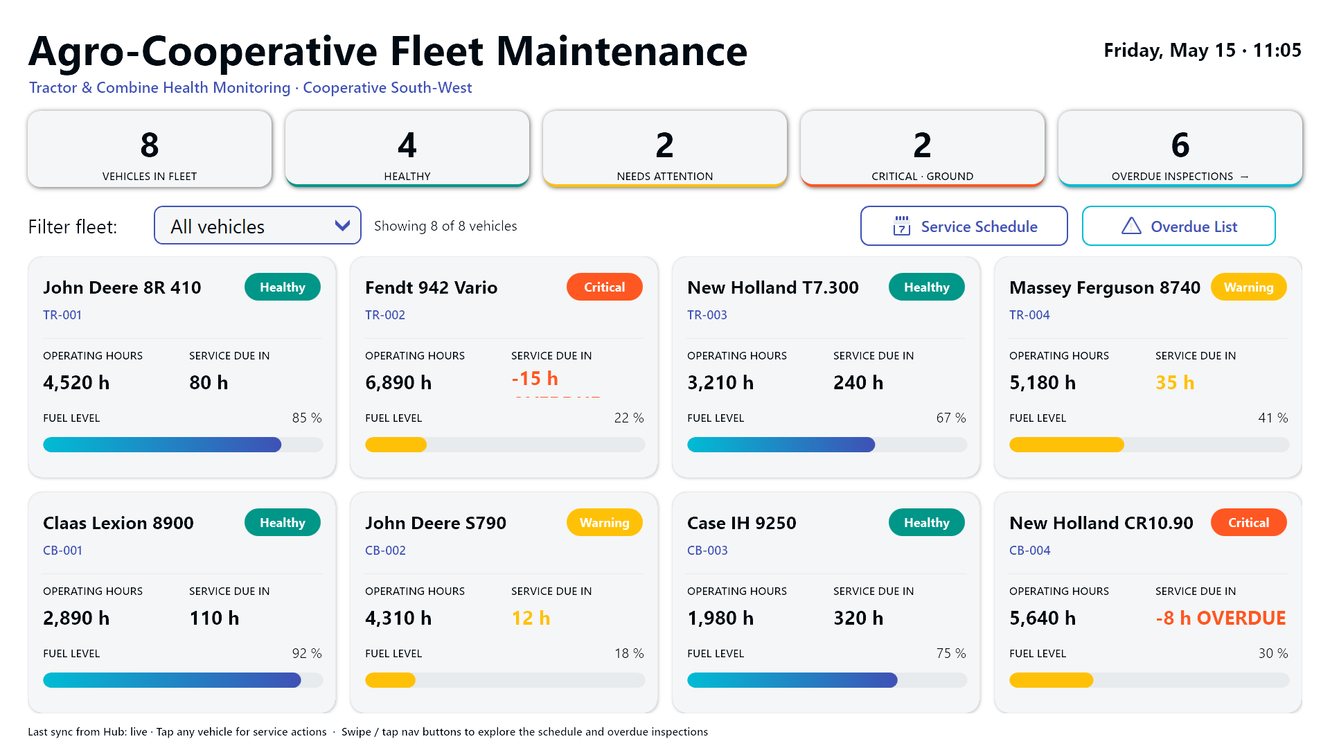
The opening screen lists all eight vehicles in the cooperative’s pool: four tractors and four combines. Each one becomes a tile carrying current operating hours, hours remaining until the next scheduled service, fuel level, and a color-coded health badge with three states (Healthy, Warning, Critical).

Above the tiles sits a strip of five KPI cards: total fleet size, healthy units, units needing attention, units that should be grounded immediately, and the overdue-inspection count. A dropdown filter narrows the grid to tractors only, combines only, or the full mixed fleet - useful when the foreman wants to focus the morning briefing on one machinery class.
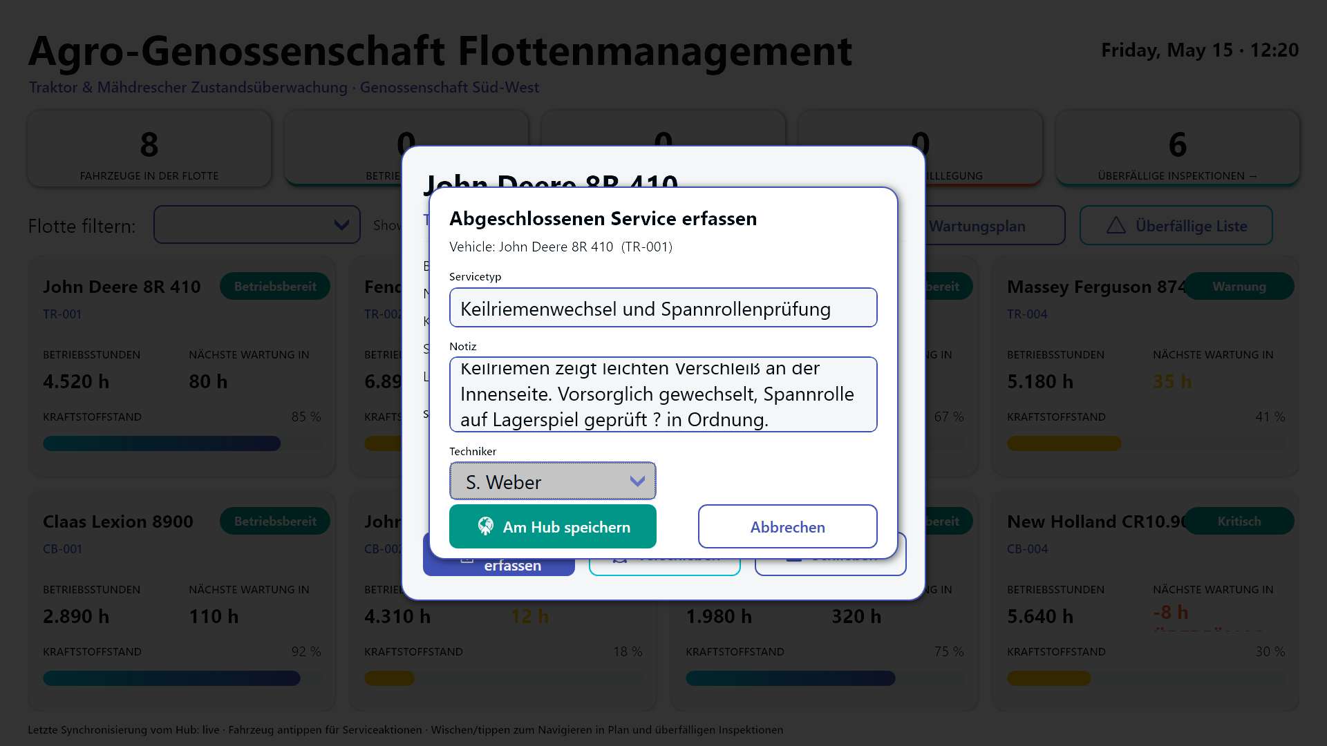
The fuel gauges shift color as they drain, and the health badge color is mirrored as a thin accent on the tile border so the row pattern is readable from across the workshop. Tapping a tile opens a modal detail dialog where the on-duty mechanic can either log a completed service (writing a row to the Hub-backed service log) or postpone the upcoming service by one day, three days, one week, or two weeks. Postponing requires a reason, which keeps the audit trail honest when an excavator gets bumped twice in a row.
Service schedule - planning the next four work weeks
The second view turns the upcoming service obligations into a Gantt-style band of cards spanning Week 20 through Week 23 (May 14 to June 11, 2026). Each scheduled job shows the date, time slot, target vehicle, service type, and the assigned technician, plus a priority bar that runs green for Normal, amber for High, and red for Critical.
Below the Gantt band, a sortable table repeats the same jobs in tabular form so the foreman can sort by date, technician, or priority. This is the view that catches collisions: two combines booked into the same bay on the same Tuesday, or a hydraulic specialist double-booked across two sites. The foreman uses it to verify bay coverage on Mondays and to spot the inevitable schedule churn caused by weather delays.
Overdue inspections - the urgent list
The third view is a single, color-banded table of regulatory checks that have already missed their due dates: TUV safety inspections, emissions tests, hydraulic pressure tests, GPS calibration. Rows are sorted with the most-overdue items first, and the urgency band runs deep red for Critical, amber for High, and blue for Medium.

Each row is tappable. Tapping opens an acknowledgement confirmation - not a “mark as done” shortcut, deliberately, because regulatory inspections need to actually happen before they can be cleared. The acknowledgement only flags that the workshop has seen the overdue item and accepted responsibility for scheduling it. The next dispatch into the field-service system happens through the cooperative’s existing process; the dashboard’s job is to make sure nothing falls off the radar.
German variant
The cooperative operates across the German-speaking Alpine region, so the dashboard ships with a full German localization for every label, KPI title, and status badge.
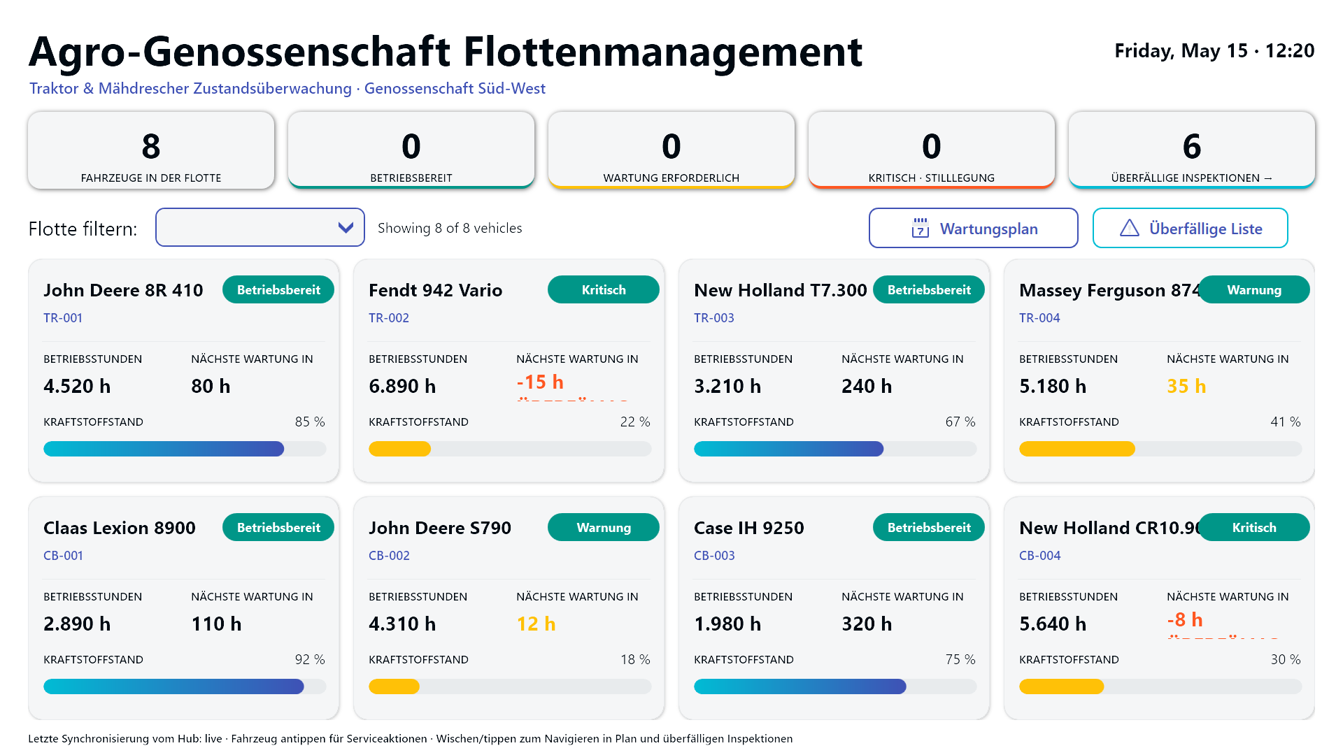

Both variants run from the same Peakboard project; the only thing that changes between deployments is the language layer.
Result
What started as a stack of paper service logs and a wall calendar covered in sticky notes becomes a single live screen that anyone in the workshop can read in two seconds and act on in two taps. The foreman sees the morning’s grounded units before pouring coffee. The mechanics log completed services from a tablet without opening a separate system. The fleet manager has a defensible answer when a member farm asks why their combine wasn’t in the field on Tuesday. And during the harvest window - the only metric that ultimately matters - the share of fleet hours lost to “we didn’t know it was overdue” drops to roughly zero.