A modern Material Recovery Facility (MRF) takes in mixed waste and turns it back into clean, marketable fractions: paper, plastic, glass, metal, and organic material. Keeping that operation profitable and compliant depends on a handful of numbers being visible at all times - how much material is moving through the plant, how clean each sorted stream is, how full the output silos are, and what each fraction is worth on the commodity market right now. In this article we bring all of that onto a single wall display so the whole sorting floor can read the health of the line at a glance.
Who the board is for
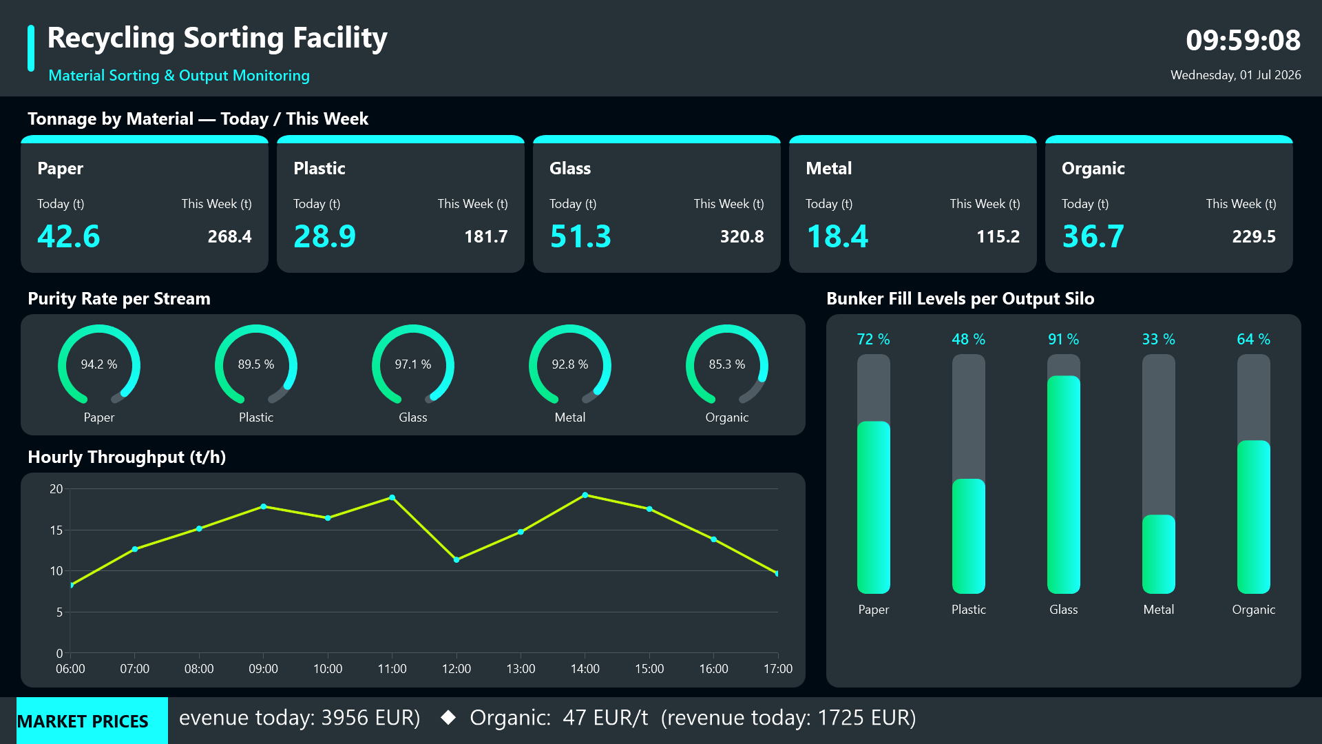
The dashboard is built for the people standing on the sorting floor: shift operators, plant supervisors, and quality managers, plus management staff who want a quick health check of the line without opening individual SCADA panels. It is designed to be mounted as a wall display in the control room or above the sorting cabin, running continuously on a 1920x1080 screen. The team monitors the entire facility from one place instead of hopping between control screens.
Tonnage: how much have we sorted?
The top of the board answers the first operational question every shift asks. Each material category gets its own card showing the tonnage sorted for the current day alongside the running weekly total. That side-by-side view lets operators tell instantly whether throughput is on target or lagging, without doing any mental arithmetic.
Purity rates as gauges
Below the tonnage cards, a row of circular gauges reports the purity rate per stream. This is the single most important quality KPI in recycling: contaminated bales lose value or get rejected outright at the buyer. Showing purity as a gauge makes an out-of-spec stream jump out immediately, so a quality manager can react before a whole batch is compromised.
Hourly throughput
An hourly throughput line chart shows the rhythm of the line across the day. Stoppages, ramp-ups, and unusual dips all show up as shape changes in the curve, which makes it easy to correlate a drop in output with something that happened on the floor.
Bunker fill levels
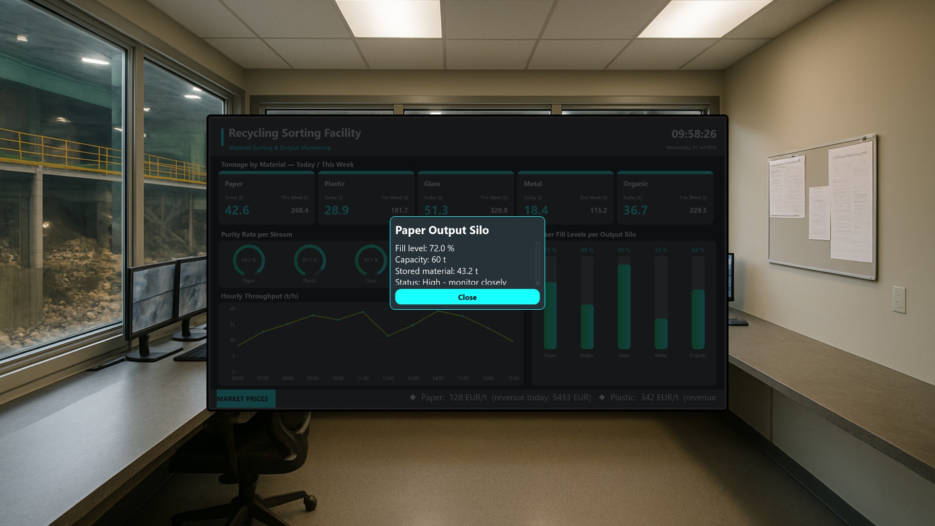
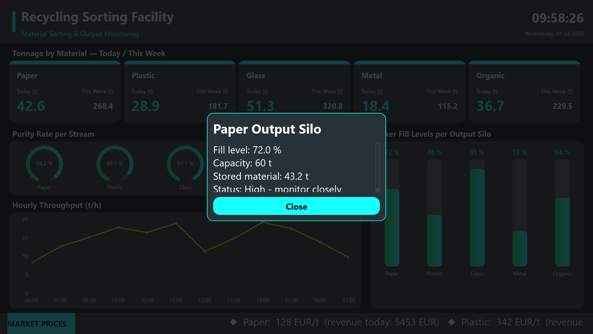
On the right, a tall bunker-fill diagram shows the live fill level of each output silo as a vertical bar gauge with a percentage readout. This is the part of the screen that prevents the most expensive problem on a sorting line: an overflowing or jammed bunker that forces an unplanned stop. An operator who sees a silo creeping toward full can schedule a baling or haul-away run before it becomes critical.
Each silo label is tappable. Touching it opens a detail dialog with capacity and fill information for that specific bunker, giving a closer look without leaving the overview. A clear Close button dismisses the dialog and returns to the full board.
Market-price ticker
Running along the bottom is a scrolling market-price ticker showing the current per-ton revenue rate for each sorted output material. This connects the operational picture to the commercial one: when steel or PET prices spike, the team knows which streams are worth prioritizing right now, turning a monitoring screen into a small decision-support tool.
Result
Interaction is deliberately light and touch-friendly. The screen is mostly a passive monitor, but the tappable silo labels let a curious operator drill into a single bunker and dismiss the dialog just as quickly. The result is one large-format board that keeps tonnage, quality, throughput, silo capacity, and market value in view at the same time, so the sorting floor can run the plant on facts instead of guesswork.