In a modern distribution center, three very different roles need to look at the same operation from three very different angles, and they need to see it in real time. This three-app suite turns a single shared backbone of order data into a synchronized picking, packing, and supervision experience that mirrors how a real fulfillment floor actually runs. A picker completing an item, a packer sealing a tote, and the supervisor watching the resulting KPI tick upward are three views of the exact same transaction.
The Picker Handheld
The first audience is the picker on the warehouse floor. They carry a ruggedized handheld or wear a wrist-mounted tablet, walking aisles in zones like A1, B3, or D5. The picker app is designed for gloved hands, noisy environments, and quick visual scanning, so everything that matters is rendered big and bright.
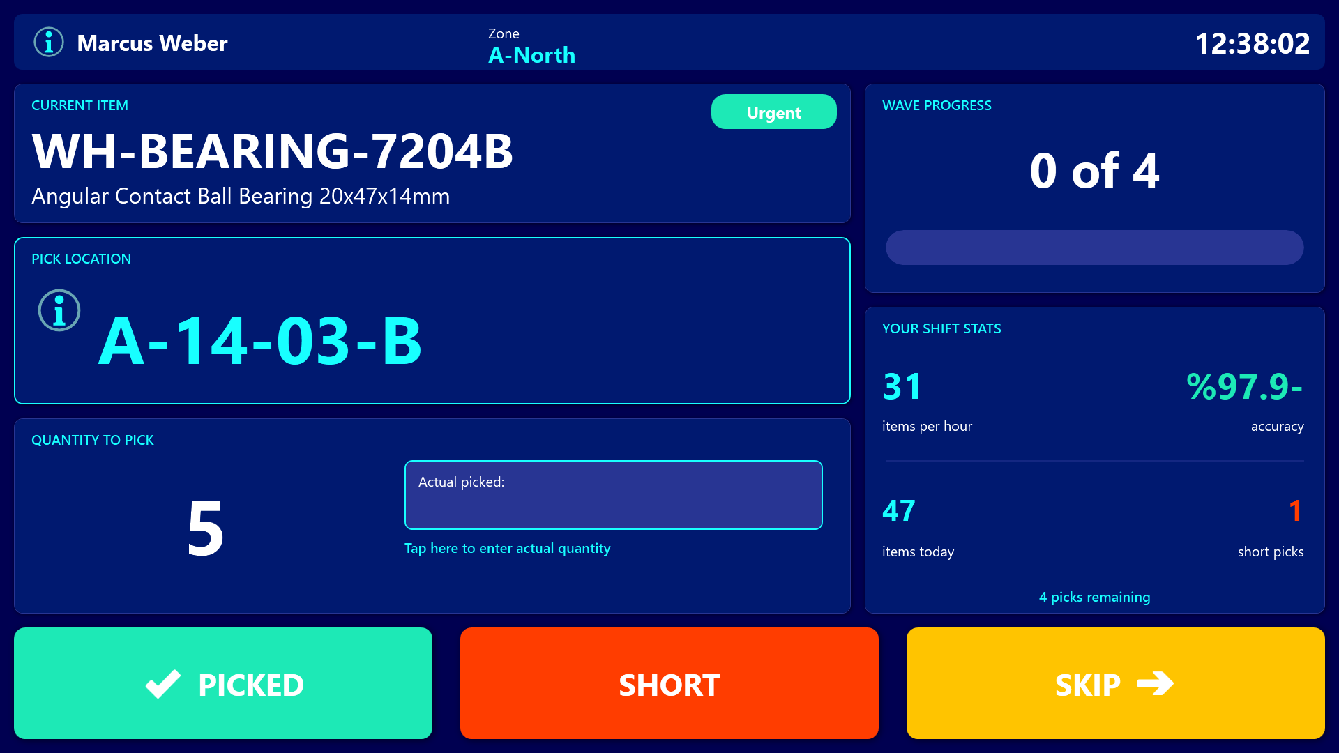
In the next second the picker needs to know exactly four things: what to grab, where it lives, how many to take, and how urgent it is. The SKU and description sit at the top, a huge cyan location label like “B3-12-04” dominates the middle so it can be read while moving, the quantity is shown in oversized digits, and a colored priority badge turns orange for Urgent or amber for High.
Wave progress is reflected by a horizontal gauge (“47 of 120”) so pickers always know how close they are to finishing, and their personal shift stats - items per hour, accuracy, short picks - sit on the right side so they can compare themselves to a normal shift in a glance.
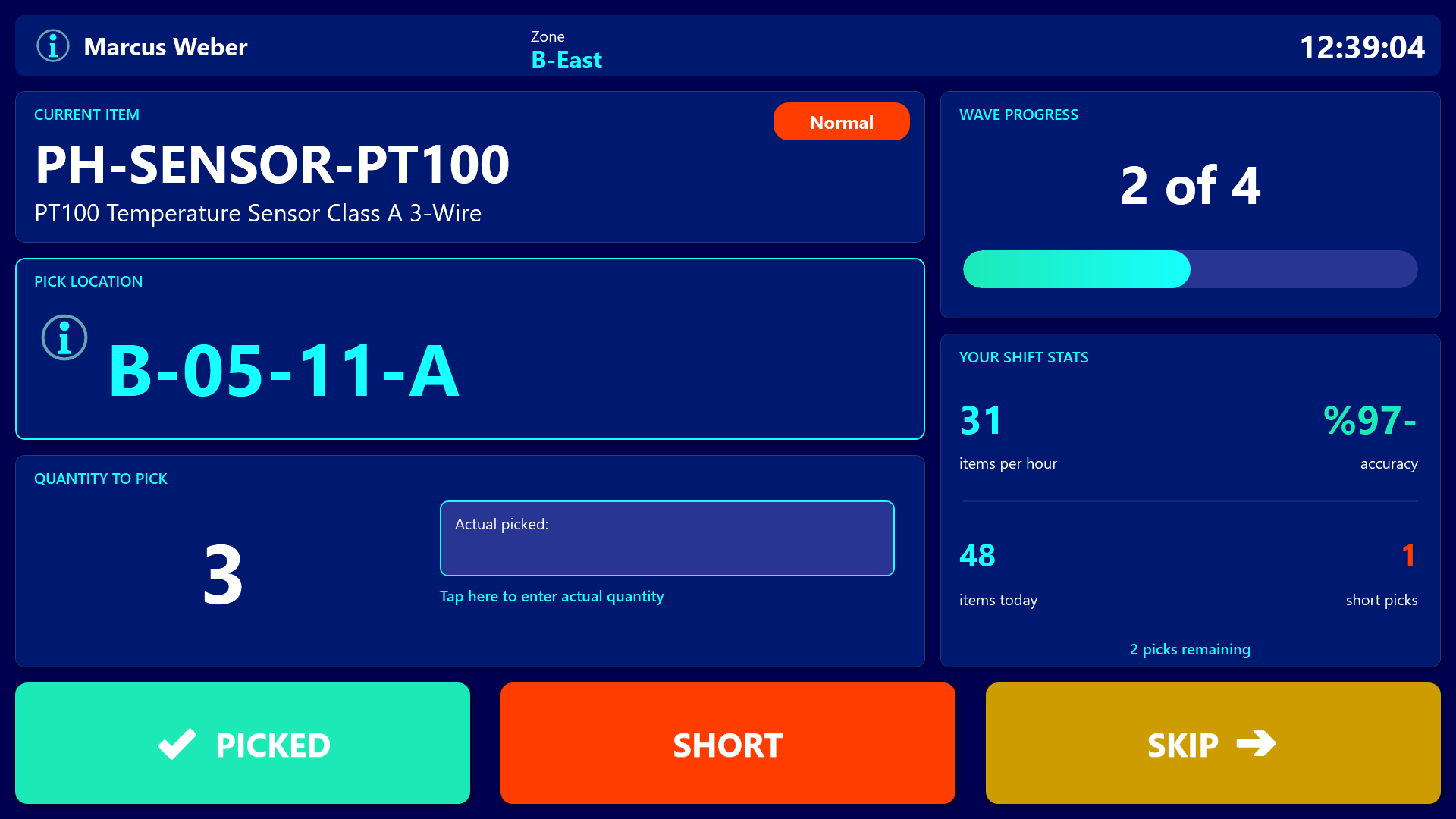
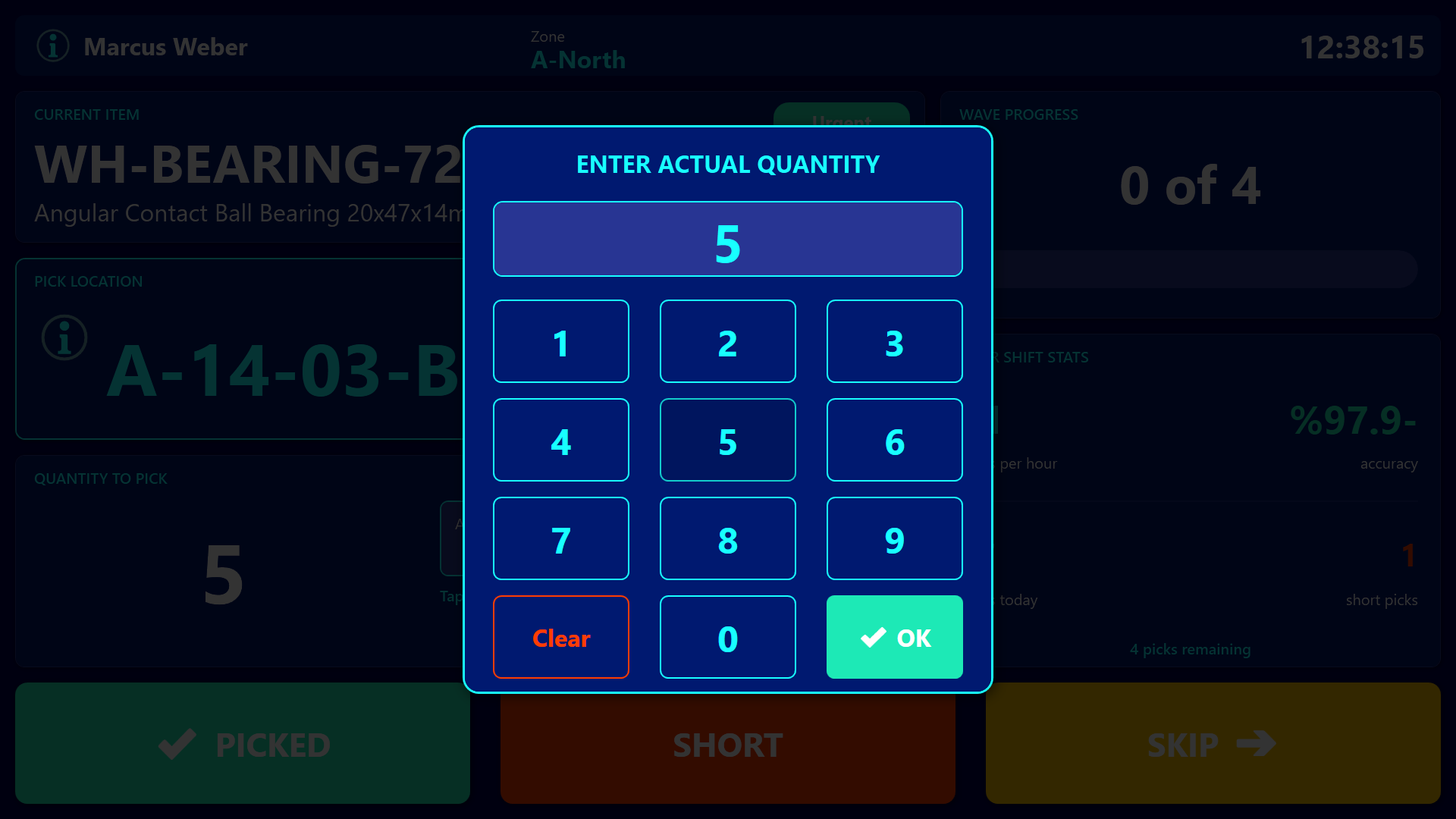
When the picker finishes an item, they tap a giant green PICKED button. If stock is missing, they tap the orange SHORT button. If they need to come back to it, they tap the amber SKIP button. If the picked count differs from the expected count, tapping the quantity area opens a full-screen numeric keypad so the picker can enter the actual amount.
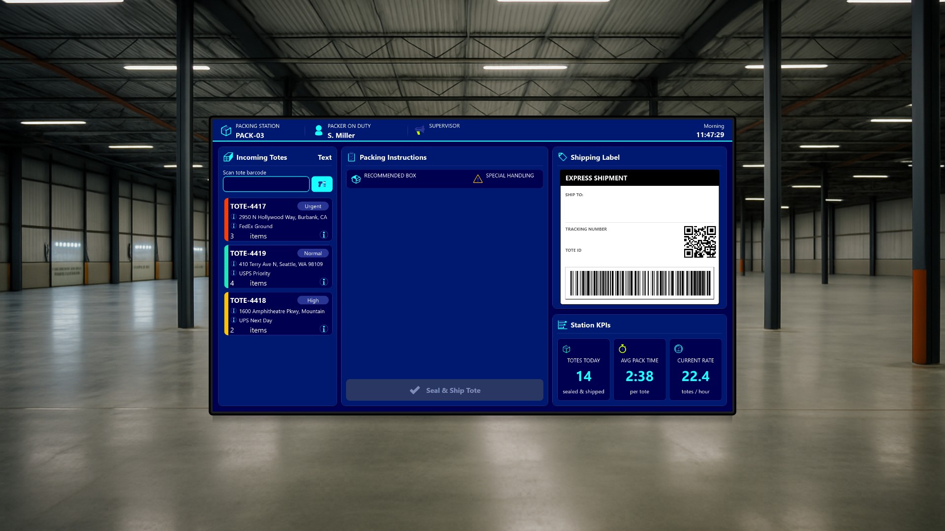
The Packing Station
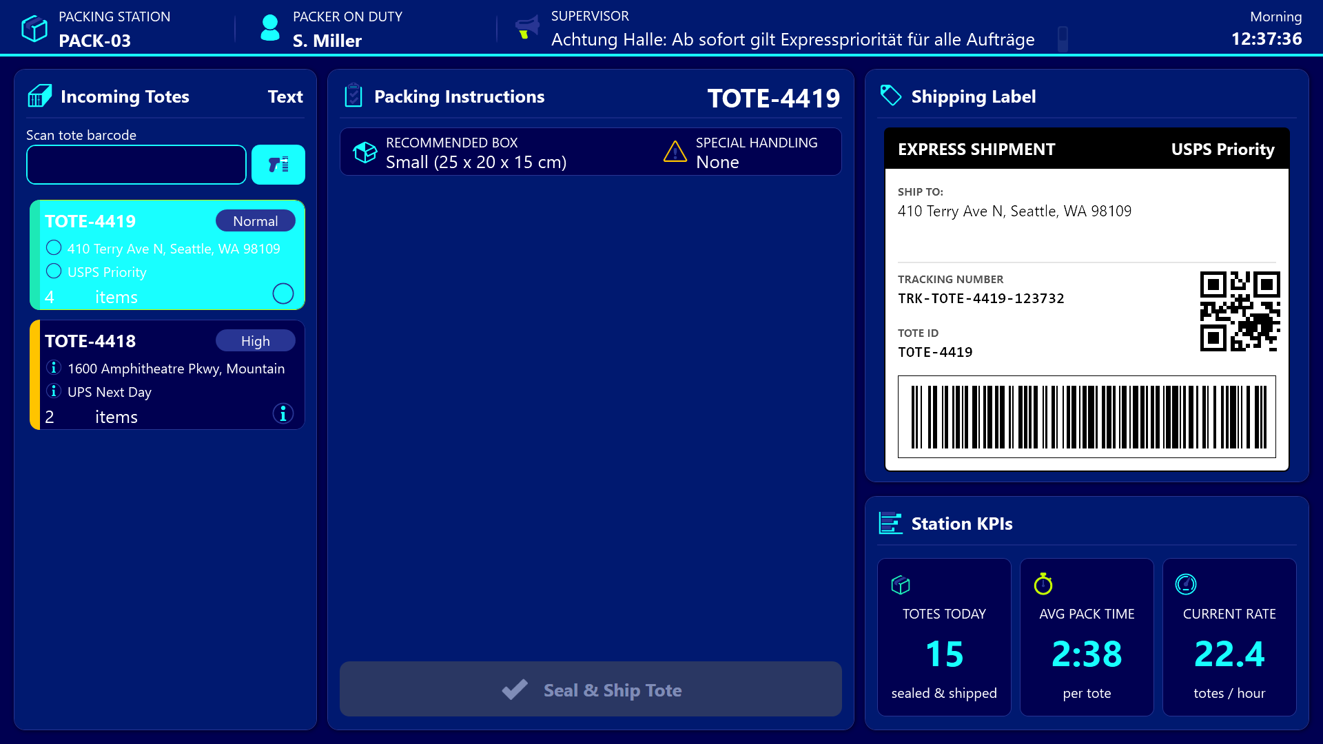
The second audience is the packer at a fixed packing station. They stand at terminal “PACK-03” with a barcode scanner clipped to the desk, and a wide 1920x1080 screen guides them from incoming tote to sealed shipment.
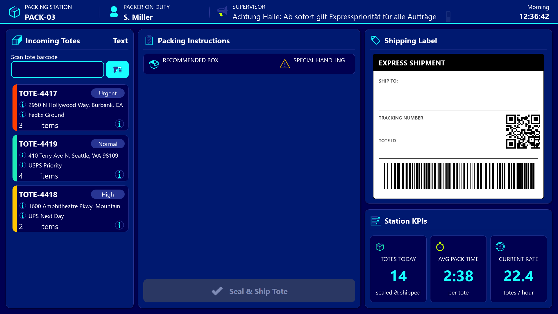
As totes finished by the pickers arrive on a conveyor, the packer sees them queue up on the left. Each tote card shows the tote ID, destination, carrier, item count, and a colored left edge that signals urgency. The packer either taps a tote card or scans the barcode on the physical tote, at which point the center panel populates with a checklist of items to pack, a recommended box size, and any special-handling note like “Fragile” or “Hazmat”. Each row turns green as the packer ticks it off.
On the right, a mock shipping label preview shows the ship-to address, carrier, tracking number, a QR code, and a stylized barcode, all rendered live from the selected tote. The packer can verify visually before printing, which catches address and carrier mismatches before they hit the conveyor. Once every checklist item is ticked, the Seal and Ship button unlocks. A tap finalizes the tote, increments the local “totes today” counter, and writes an event back to the shared event log.
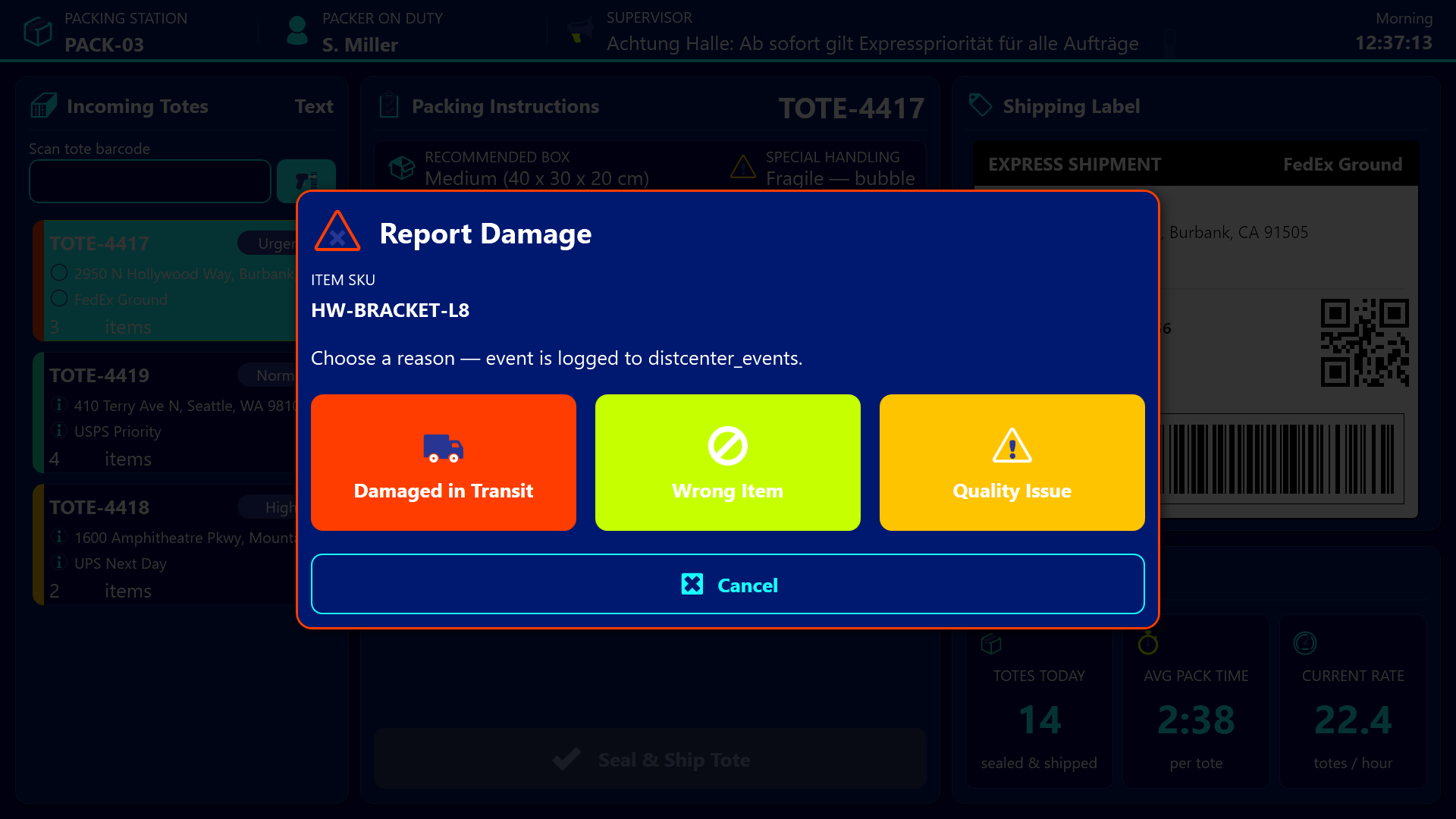
If an item is broken or wrong, a per-row warning button opens a damage report dialog with three large reason buttons: Damaged in Transit, Wrong Item, Quality Issue. The choice is logged as an event so the supervisor sees the problem the moment it is reported instead of at end-of-shift reconciliation.
The Supervisor Dashboard
The third audience is the floor supervisor sitting in a glass office overlooking the warehouse, with a large wall-mounted screen running the supervisor dashboard. They see the whole operation in a single view.
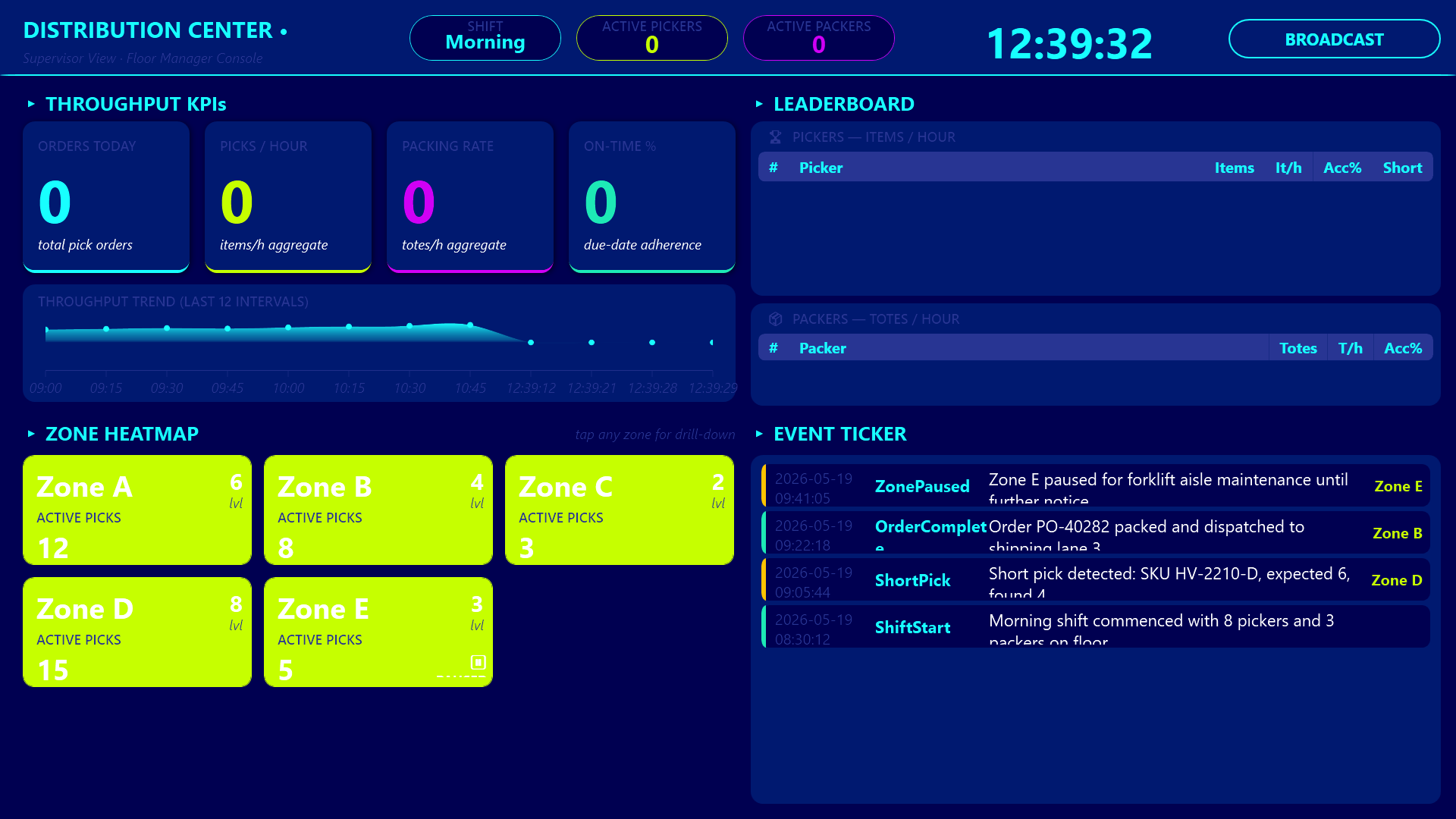
The header row carries throughput KPIs - orders today, picks per hour, packing rate, on-time percent - followed by a 12-bucket throughput trend area chart so spikes and dips during the shift are obvious at a distance.
A podium-style leaderboard ranks the top pickers with gold, silver, and bronze row highlights, and a separate ranking does the same for packers. The competitive framing rewards consistent performers and exposes who needs coaching.
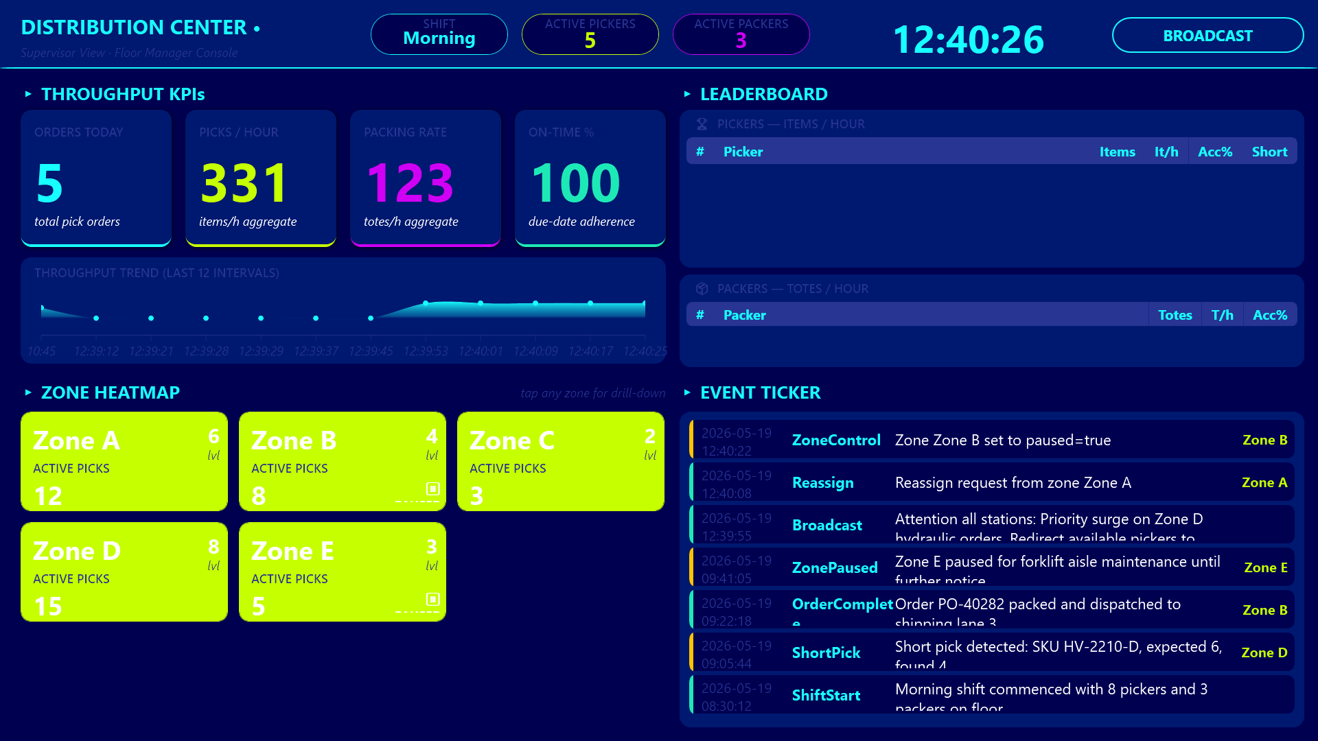
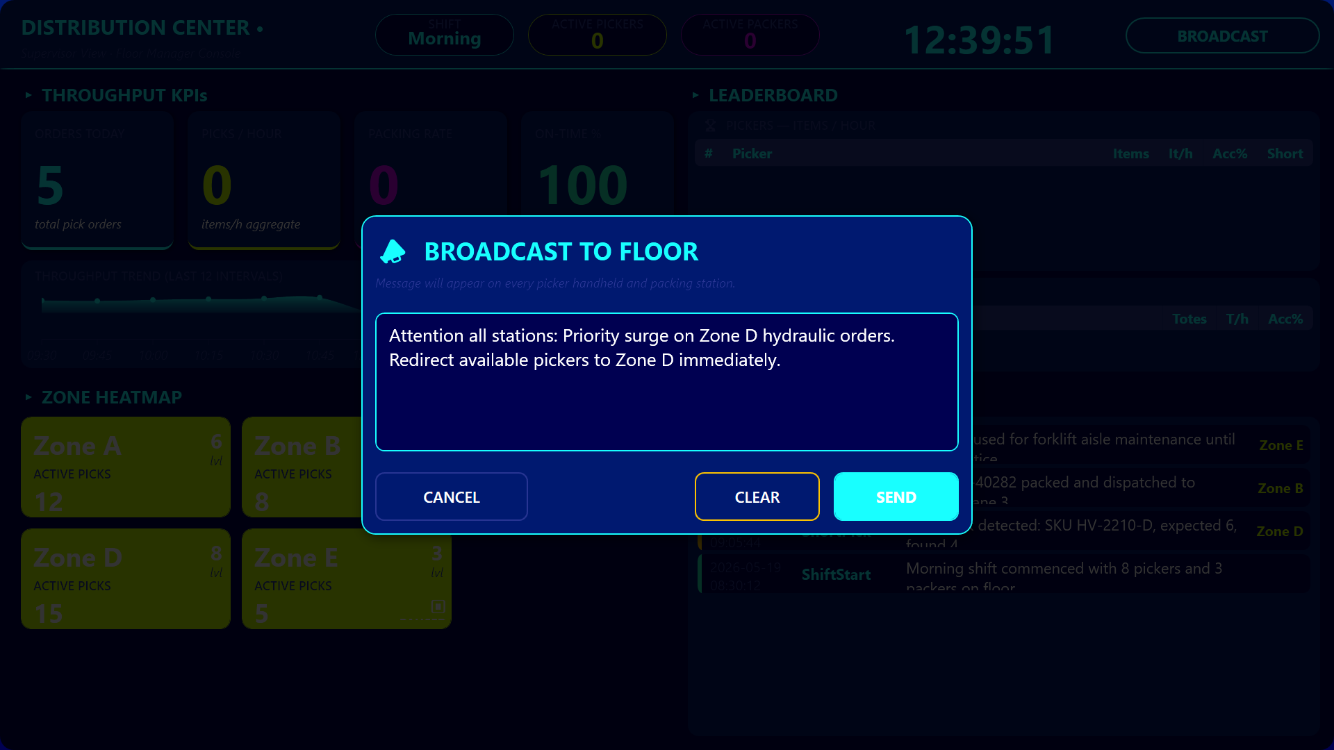
An interactive zone heatmap shows eight zone tiles that color-code activity - green for mild, lime for low, amber for warm, red for hot, gray for paused - and a live event ticker streams the most recent picks, packs, damages, and broadcasts. When the supervisor spots a hot zone, they tap its tile to open a zone detail dialog listing every picker currently working there, with options to pause the zone or reassign a picker. From the header, a Broadcast button opens a multi-line text dialog that pushes a message live onto every picker handheld and packing station header banner, so the supervisor can announce “Wave 4 starts in 5 min” or “Aisle C blocked, use D” to the entire floor at once.
How the Three Apps Stay in Sync
The three apps stay coherent because they all read from and write to the same shared Hub lists - distcenter_pickorders, distcenter_totes, distcenter_events, distcenter_pickerstats, distcenter_zonestatus - and shared Hub variables for the current picker, the current packing station, the broadcast message, and the shift. The picker handheld and the packing station are not isolated apps with their own little databases. They are windows onto the same operation, and the supervisor dashboard is the third window that aggregates everything those windows are doing.
Conclusion
A distribution center is not a single screen problem. The picker needs glanceable, gloved-hand action buttons. The packer needs a checklist and a label preview. The supervisor needs KPIs, rankings, and a heatmap. By splitting the operation into three role-specific apps that share one Hub backbone, every person on the floor gets exactly the view they need, and every action they take is instantly visible to everyone else who depends on it.